

App Redesign
Transforming User Experience Through Iterative Design & Testing.
Project overview
Transforming a struggling mobile app during COVID-19 - A STAR case study showing how user-centered design methodology solved critical usability failures, rebalanced feature hierarchy, and drove significant business growth through systematic research and iterative testing.
✨ Design Impact Highlights
- Significant increase in sales & reward redemptions
- Reduced customer service calls through improved usability
- Successfully balanced product comparison with rewards features
- Delivered both light & dark mode experiences</aside>

🎯 The Design Challenge
Context & Problem Space
In 2021, during the COVID-19 pandemic, the mobile app faced critical challenges:
- Active usage declined as cinema and restaurant visits dropped
- Feature imbalance between product comparison and rewards
- Usability issues accumulated over years without resolution
- Mental model mismatch - users couldn't find discount features
Mission Statement
Make the app more balanced between sales and rewards, while fixing critical usability problems customers faced when using discounts.
Business Goals Alignment
- 📈 Increase monthly active users
- 💰 Boost product sales through the app
- 📊 Grow revenue share from mobile
- 📲 Improve app store downloads
- 📞 Reduce customer service enquiries
🔍 Research & Discovery
1. Existing UX Research Review
🔬Key Finding: Very few customers realized the golden button in the top right was how to generate discount codes - a critical discovery failure in the UI.
Collaborated with dedicated UX research team to:
- Review years of accumulated insights
- Identify known usability problems
- Understand user mental models
- Map pain points in discount claiming journeys
2. Usage Metrics Analysis
Time Period: Pre-COVID
Key Insights: High reward generation, balanced usageUnderstand baseline behavior patternsPost-COVID.
Design Implications: Dramatic drop in cinema/restaurant featuresNeed to rebalance feature prominence.
3. App Store Reviews Analysis
Methodology:
- Exported 1 year of review data using data.ai
- Applied Excel logic functions for categorization
- Filtered irrelevant reviews
- Identified top complaint categories

Top User Complaints:
- Can't find discount codes
- Confusing navigation
- Features hidden or unclear
- Too many steps to complete tasks
4. Remote Stakeholder Workshop
Workshop Structure (2 days, ~15 stakeholders):
Day 1: Problem Discovery
├── Affinity Mapping
├── Pain Point Clustering
└── Impact vs Effort Matrix

Day 2: Solution Prioritization
├── Feature Prioritization
├── Success Metrics Definition
└── Release Phasing

🗺️ Information Architecture Redesign

App Flow Mapping
Created comprehensive flow diagram to understand:
- How functions interconnected
- User journey paths
- Feature dependencies
- Navigation bottlenecks
IA Strategy
Remove
- Redundant features
- Unused sections
- Confusing pathways
Reorganize
- Group related features
- Logical navigation hierarchy
- Intuitive categorization
Refine
- Simplify existing flows
- Reduce steps to completion
- Clear labeling


Design Philosophy
"Only change what was necessary to achieve business goals" - Respecting the company's risk-averse culture while driving meaningful improvements
💡 Design Solutions
Solution 1: Homepage Shortcuts Revolution
🚀Challenge: Users couldn't quickly access rewards and discount codes
Hypothesis: More shortcuts = faster access
Testing Result: UNEXPECTED - Users hit the first button that somewhat resembled their goal
Final Solution: One clear shortcut per reward type
- Reduced cognitive load
- Faster decision making
- Higher success rates
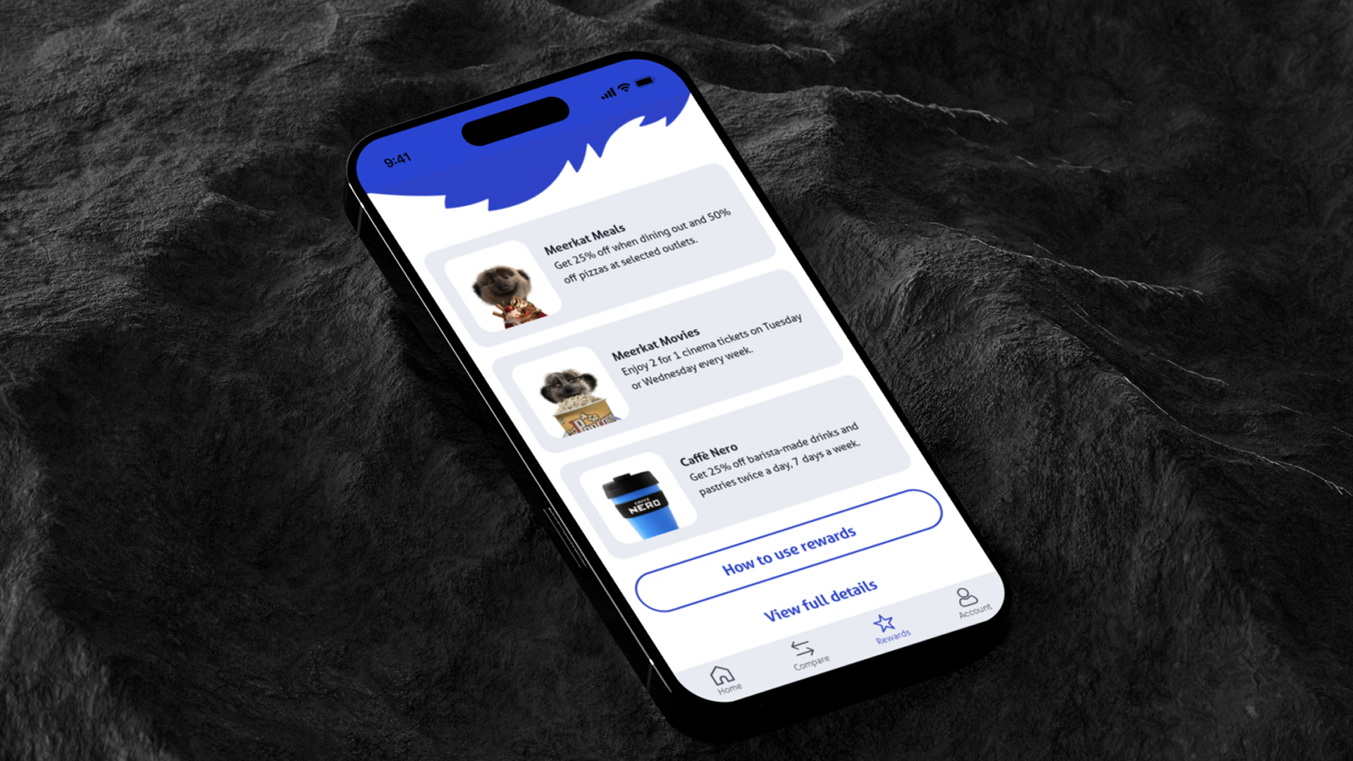
Solution 2: Reward Discovery Enhancement
Design Changes:
- Prominent reward buttons on relevant screens
- Visual hierarchy improvements
- Clear CTAs replacing ambiguous golden button
- Progressive disclosure for complex features
Solution 3: Navigation Simplification
Before: 5+ taps to generate discount code
After: 2 taps maximum from any screen
Implementation:
- Sticky "2 for 1 code" button on movie screens
- Contextual shortcuts based on user location in app
- Simplified information display (only showing available days)
🧪 Design Process & Testing
Iterative Design Approach
🔄 Design → Prototype → Test → Learn → Iterate
Advanced Prototyping
Tool: Axure RP
Fidelity: Near-production behavior
Why High Fidelity?
- Realistic user behavior in tests
- Accurate gesture interactions
- True-to-life navigation flows
- Minimal imagination required from testers

User Testing Methodology
Key Findings
Design Changes
1.Navigation & IAUsers lost in deep hierarchies: Flattened navigation structure
2. Shortcut effectivenessToo many options cause paralysis: Reduced to single shortcutsRound
3. Final validation: Significant improvement in task completion
Testing Tool: UserZoom for unmoderated remote testing
Sample Size: 8-12 users per round
Success Metrics: Task completion rate, time to complete, error rate
🎨 Visual Design Evolution
Phase 1: Initial Redesign
Focused on:
- Information architecture
- Feature placement
- User flow optimization
- Functional improvements


Phase 2: Brand Guidelines Update
Plot Twist: "Those were not the final designs after all!"
New brand guidelines arrived mid-project, requiring complete visual reskin while maintaining all UX improvements.
App Reskin Implementation
Design System Components:
- Complete Figma component library
- Light & dark mode support
- Consistent design tokens
- Accessibility-first approach
Visual Improvements:
🌞 Light Mode
├── High contrast ratios
├── Clear visual hierarchy
├── Accessible color palette
└── Reduced eye strain

🌙 Dark Mode
├── OLED optimization
├── Reduced blue light
├── Maintained readability
└── Consistent experience
Continuous Optimization
Each area re-evaluated during reskin:
- Further simplification opportunities
- Visual hierarchy refinements
- Micro-interaction additions
- Performance optimizations
📊 Design Impact & Results
Quantitative Improvements
📈 User Engagement
- Significant increase in sales via app
- Higher reward redemption rates
- Improved monthly active users
- Better app store ratings
🎯 Usability Metrics
- Reduced customer service calls
- Faster task completion times
- Lower error rates
- Higher feature discovery
Qualitative Improvements
✨ User Confidence: Clear pathways reduced hesitation
✨ Feature Discovery: Previously hidden features now accessible
✨ Mental Model Alignment: Design matched user expectations
✨ Brand Perception: Modern, helpful, user-friendly
🚀 Key Design Decisions
1. One Button Philosophy
Learning: More options ≠ Better UX
Application: Single, clear CTAs per reward type
Result: Reduced decision fatigue, increased conversions
2. Contextual Assistance
Learning: Users need help where they are, not in help sections
Application: Sticky contextual buttons on relevant screens
Result: Dramatic reduction in support queries
3. Progressive Disclosure
Learning: Show only what's needed when it's needed
Application: Simplified initial views with expandable details
Result: Cleaner interface, less overwhelming
4. Platform Flexibility
Learning: Business needs change, design must adapt
Application: Modular IA supporting feature addition/removal
Result: Seamlessly added Caffè Nero rewards later
💭 Design Learnings & Insights
Major Takeaways
1. Test Assumptions Early
The "more shortcuts = better" hypothesis failed in testing. Real user behavior often surprises.
2. Iterative Design Works
Three rounds of testing caught issues that would have been expensive post-launch.
3. Balance Risk & Innovation
Working within risk-averse culture still allowed meaningful improvements.
4. Design Systems Save Time
Figma component library made rebrand manageable despite tight timelines.
5. Data + Intuition
Combining analytics with user research provided complete picture.
🛠️ Tools & Methodologies
Research Tools
- Google Analytics: Usage metrics analysis
- **data.ai:** App store reviews export
- Excel: Review categorization & analysis
- Miro: Remote workshop facilitation
Design Tools
- Figma: UI design & component library
- Axure RP: High-fidelity prototyping
- UserZoom: Unmoderated user testing
- Principle: Micro-interactions
Methodologies Applied
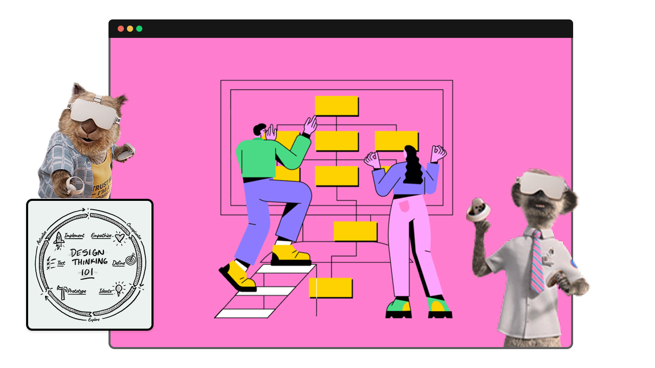
- Design Thinking: Empathize → Define → Ideate → Prototype → Test
- Atomic Design: Component-based system
- Jobs-to-be-Done: Understanding user goals
- Lean UX: Rapid iteration cycles
🎯 Success Metrics Achieved
📊 BUSINESS METRICS
├── ✅ Increased sales through app
├── ✅ Higher app revenue share
├── ✅ More monthly active users
├── ✅ Improved app store downloads
└── ✅ Reduced customer service calls

😊 USER SATISFACTION
├── ✅ Easier reward discovery
├── ✅ Faster task completion
├── ✅ Clearer navigation
├── ✅ Better feature balance
└── ✅ Reduced frustration
🔮 Future Considerations
Scalability
- Modular IA supports future feature additions
- Design system enables consistent updates
- Component library facilitates rapid iteration
Emerging Patterns
- Voice UI integration potential
- Personalization opportunities
- AI-driven recommendations
- Gesture-based navigation
💡 Conclusion
This redesign demonstrates how iterative, user-centered design can transform a struggling app into a successful digital product. By combining thorough research, careful testing, and thoughtful implementation, we achieved significant improvements in both business metrics and user satisfaction.
The project's success came from:
- Understanding users through multiple research methods
- Testing assumptions before implementation
- Iterating based on feedback rather than opinions
- Balancing business needs with user experience
- Adapting to change when brand guidelines updated
Final Thought
Great UX design isn't about adding more features or buttons - it's about understanding what users truly need and delivering it in the simplest, most intuitive way possible. Sometimes, less really is more.
This case study showcases the power of iterative design and user testing in creating successful digital products, even within constraints of risk-averse environments and changing requirements.


