Description
COMPANY iD Mobile | ROLE Design Manager | IMPACT Brand unification |
The Problem
iD Mobile launched in 2015 as Carphone Warehouse's own-brand mobile network — a challenger competing against established players like EE, O2, and Three. The initial branding was rushed to market, and over two years, inconsistencies had accumulated.
The website said one thing. The app looked different. Marketing materials felt disconnected. In-store displays didn't match digital. For a brand trying to build trust in a competitive market, this fragmentation was undermining credibility.
The business needed a cohesive visual identity that could scale across every customer touchpoint — from billboard to checkout screen.
What I Did
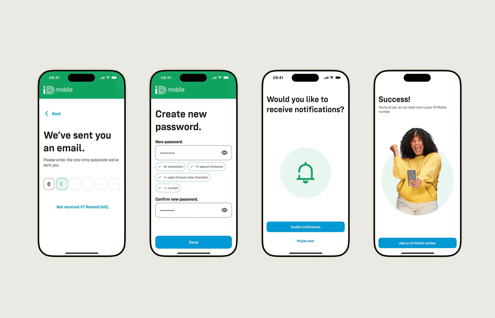
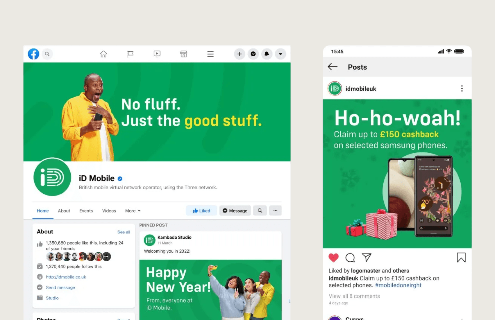
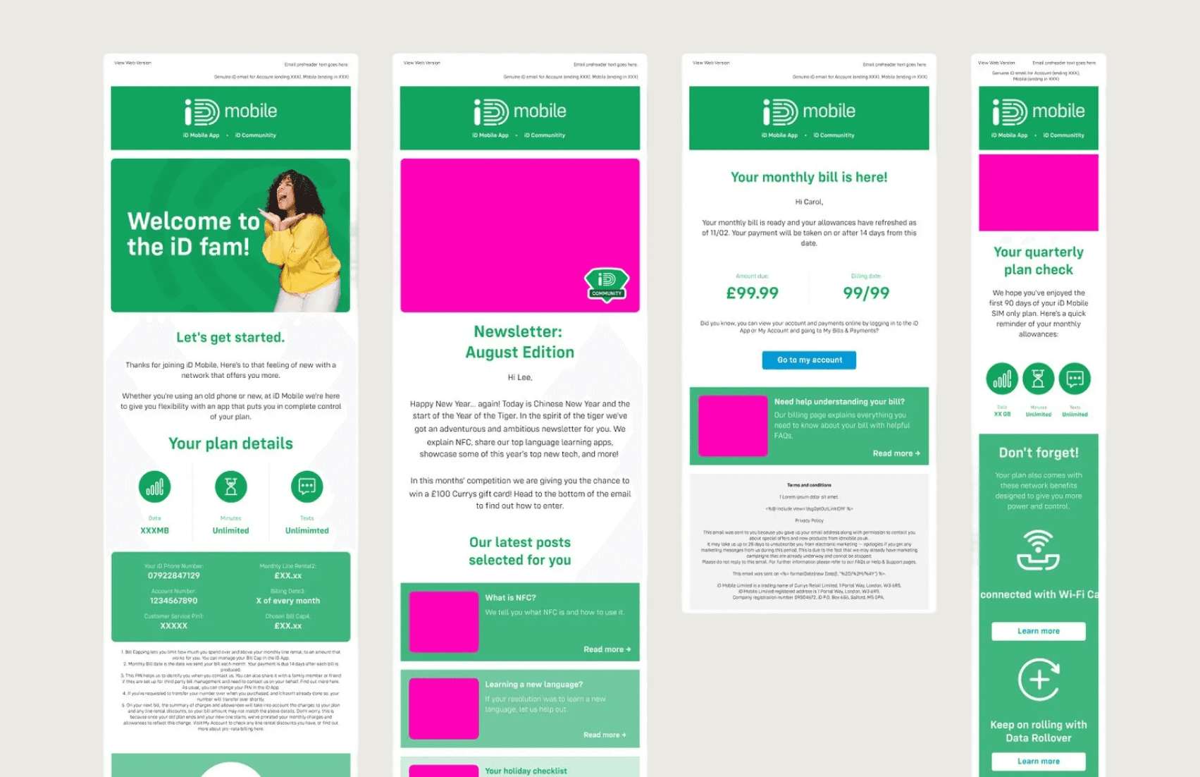
I led the evolution of iD Mobile's digital brand identity, creating a unified design language that worked across all platforms and touchpoints.
My responsibilities:
Audited existing brand applications across web, app, retail, and marketing
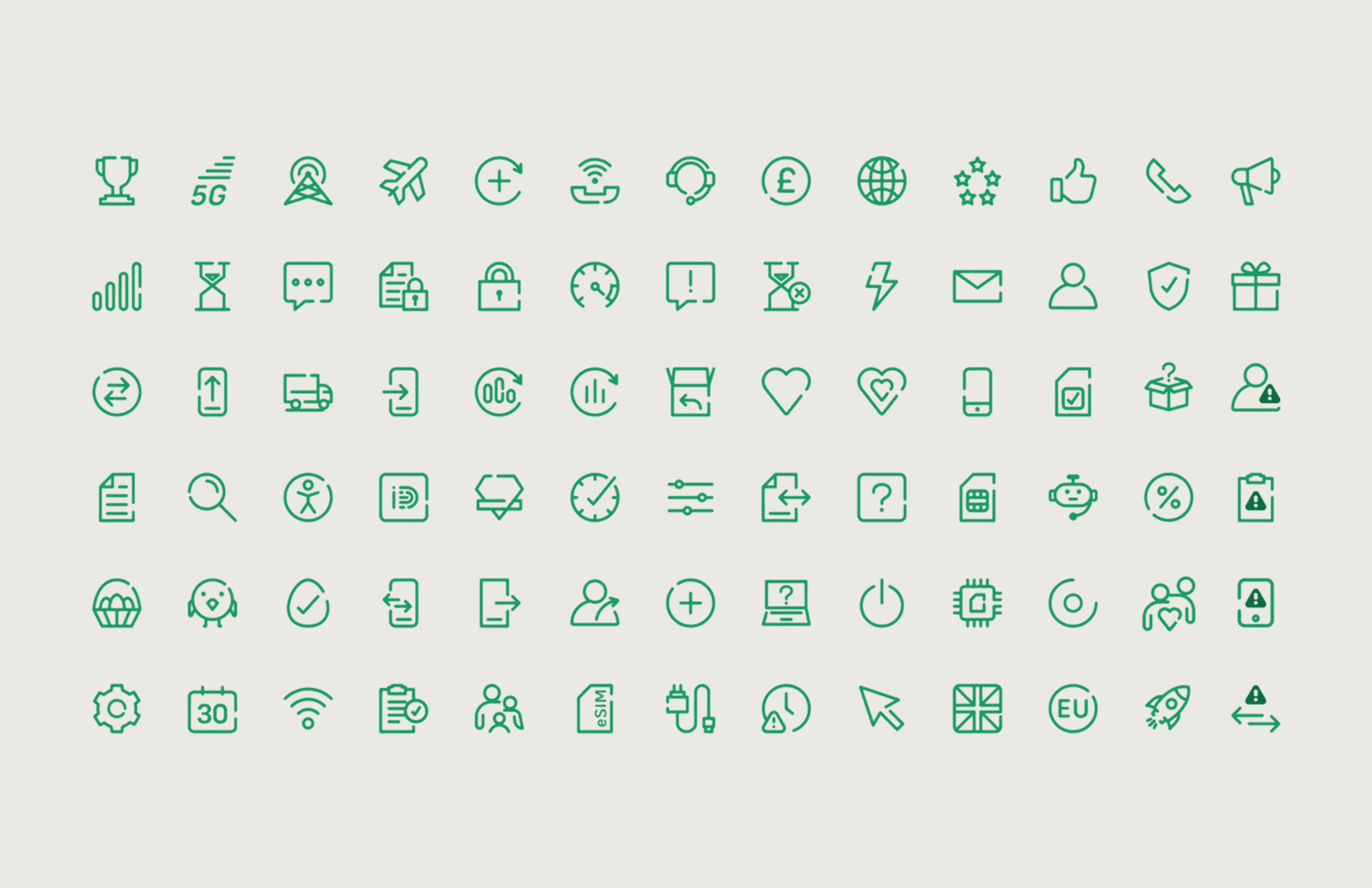
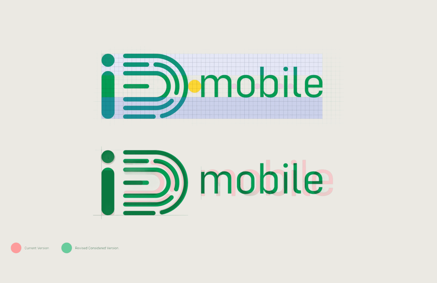
Defined the evolved visual identity system (typography, color, imagery, iconography)
Created comprehensive brand guidelines for digital applications
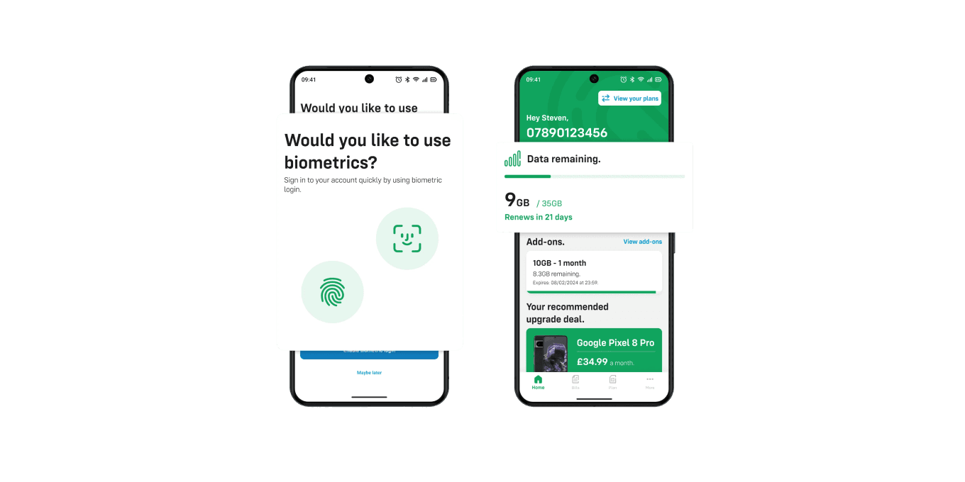
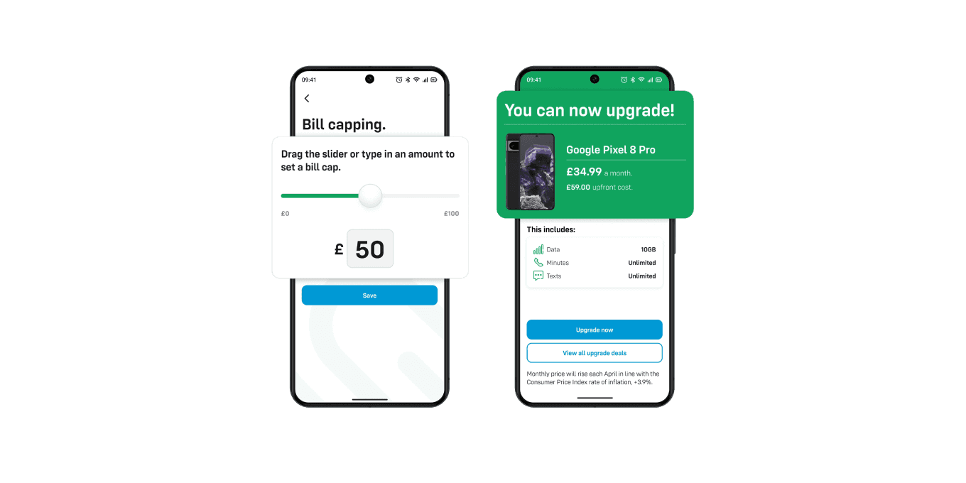
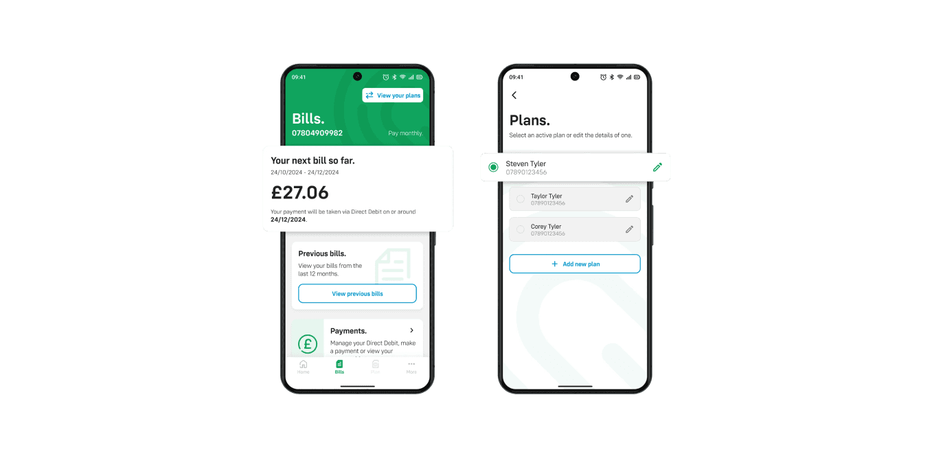
Designed key templates and components for web and app
Collaborated with marketing to ensure campaign alignment
This wasn't a rebrand — it was bringing discipline to an existing identity that had drifted.
Key Design Decisions
1. Embrace the constraints
The core brand elements — the purple, the wordmark, the value-focused positioning — were fixed. Rather than fighting these constraints, I worked within them to create a more sophisticated expression of the existing identity.
2. Digital-first hierarchy
Previous guidelines prioritized print. I restructured the system around digital requirements: accessible color contrast, mobile-friendly typography scales, and component-based thinking.
3. Scalable flexibility
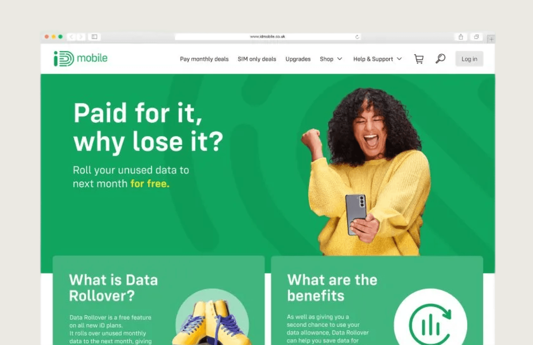
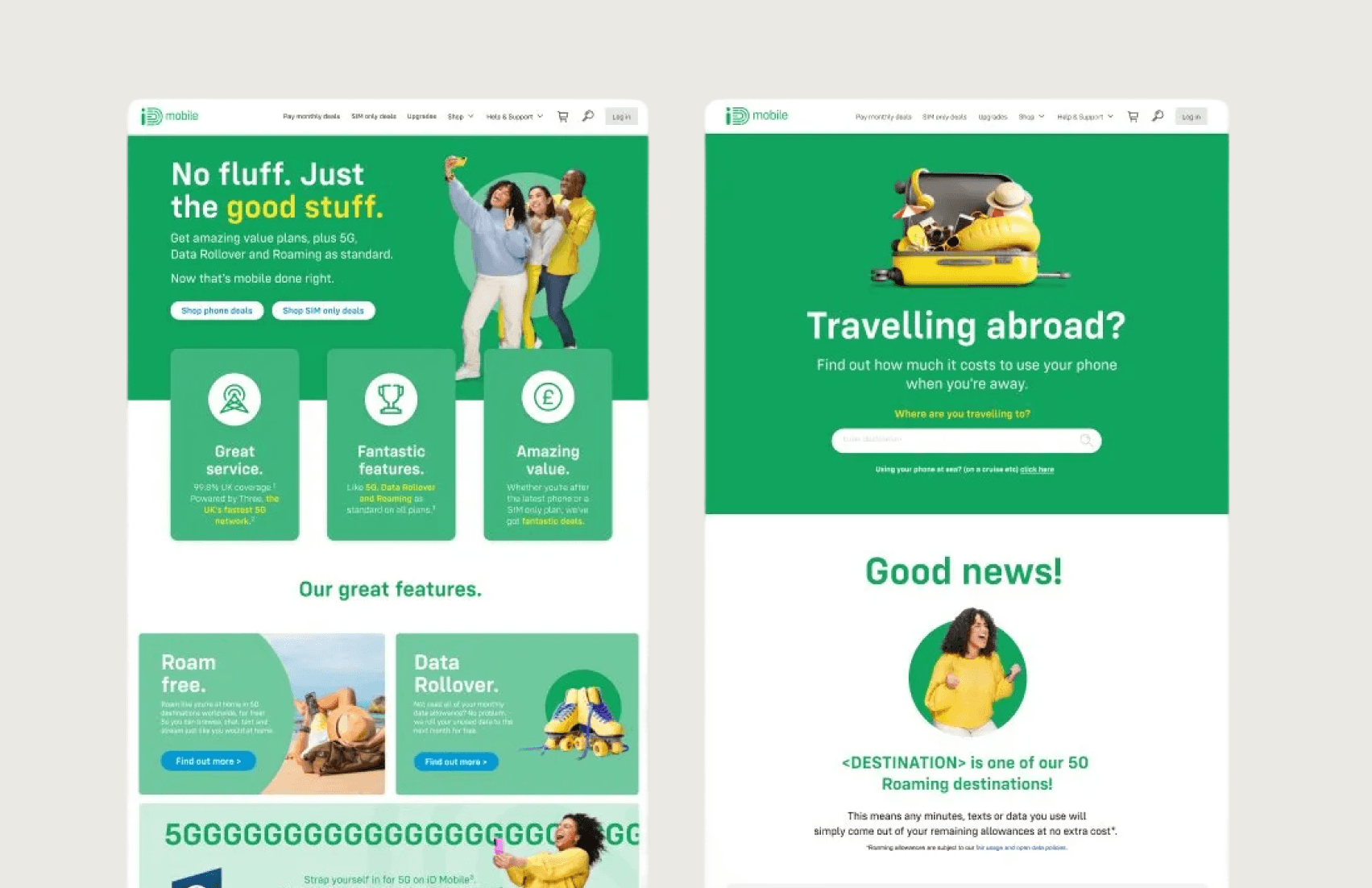
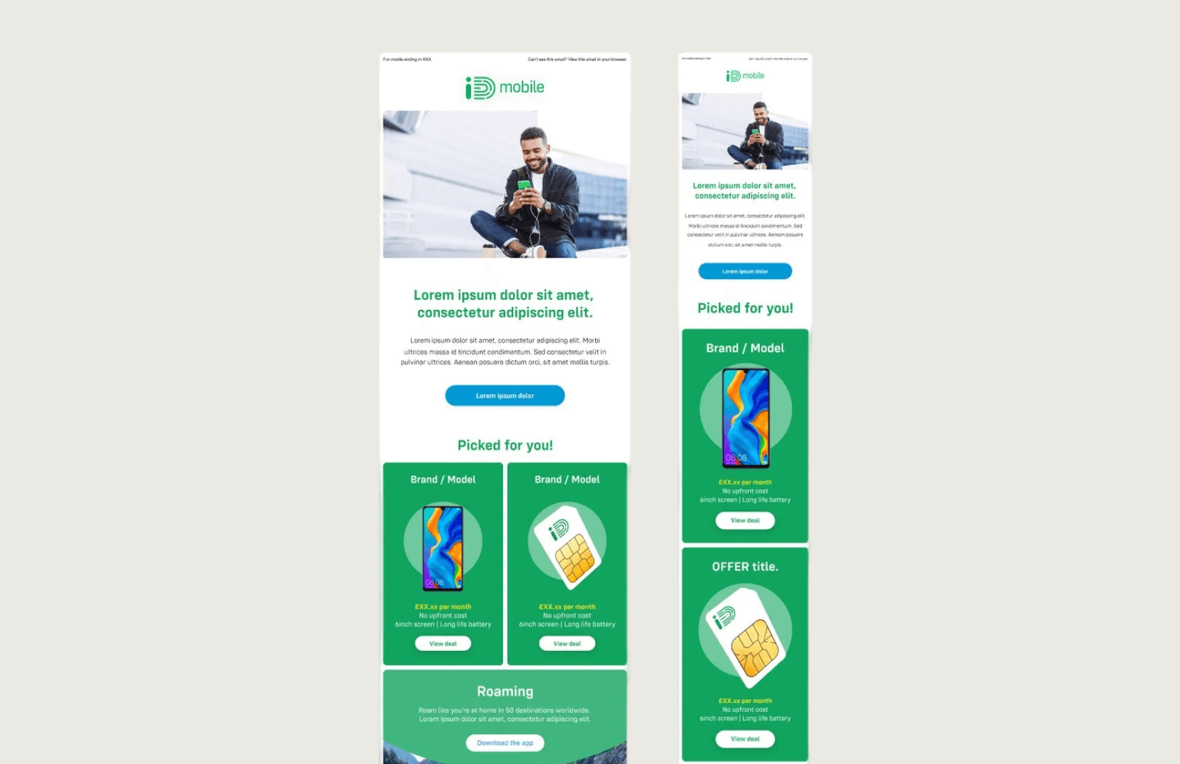
Created a modular system that maintained consistency while allowing contextual adaptation. A homepage hero and a checkout confirmation email should feel like the same brand without being identical.
Results
Outcomes from this project were primarily qualitative:
Unified brand expression across web, app, and retail
Reduced design debt and inconsistency
Faster design-to-development handoff with documented standards
Foundation for subsequent marketing campaigns
The evolved identity supported iD Mobile's continued growth in a competitive market, though specific conversion metrics were not isolated to this initiative.
What I Learned
Brand evolution is harder than brand creation. When you're building something new, you have freedom. When you're unifying something that already exists across multiple teams and touchpoints, you're negotiating with history. Success requires diplomacy as much as design skill.
My Role
✓ Brand audit and gap analysis
✓ Visual identity evolution
✓ Digital brand guidelines
✓ Template and component design