
Description
COMPANY | ROLE | IMPACT |
|---|---|---|
Compare the Market | Senior Product Designer | Car Insurance · Cross-sell · Mobile |
The Problem
Walk through the Compare the Market car insurance funnel and you'd think you were looking at a product that had never been challenged. The page works — users convert, quotes start, results load. But beneath the surface it carries assumptions that compound quietly into real lost revenue.
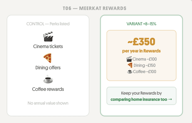
A CTA that asks new visitors to choose between two equally weighted actions before they've committed to anything. A savings claim buried in the sub-hero where scan-readers never reach it. An app install banner firing at the top of every session, on users who've never heard of the Meerkat app. A rewards block that lists perks but never quantifies them.
None of these were mistakes. They were reasonable decisions that were never tested. CTM sends millions of users into this funnel every month — a fraction-of-a-percent improvement is worth millions in incremental revenue. The funnel didn't need a redesign. It needed a structured challenge.

What I Did
I treated the CTM car insurance funnel as a product to be optimised, not a page to be redesigned.
Rather than jumping to solutions, I built an evidence-based test backlog using a three-phase process:
Conducted an end-to-end funnel walk across desktop, mobile, and tablet — cataloguing every friction point, trust gap, and missed intent signal from landing through quote completion
Developed 12 A/B test hypotheses across three areas: car insurance funnel mechanics, cross-sell and upsell, and mobile experience
Scored each test on impact, confidence, and effort using RICE, then prioritised into P1, P2, and P3 tiers
Built hi-fidelity prototypes for all six P1 tests using real CTM design tokens extracted from the live Figma file (node 154:11518) and live site CSS
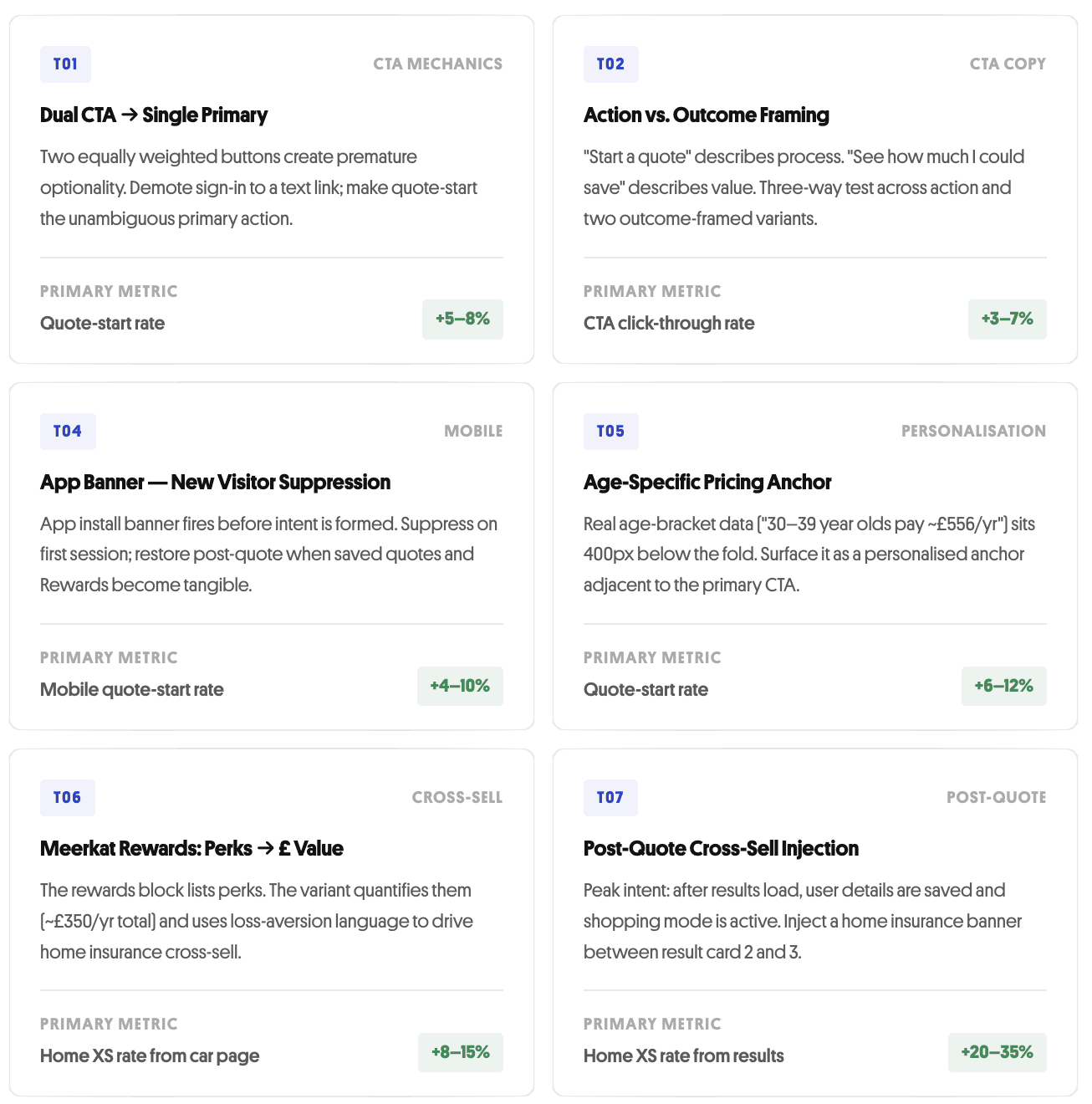
P1 Test Results
Prototype Standards
Every prototype was built to the same brief: close enough to the live product that stakeholders evaluate the UX decision, not the visual fidelity.
Real CTM design tokens — cobalt (#2843d0), border radii, type scale — extracted from the live site and Figma node 154:11518
White two-column hero layout matching the actual car insurance page architecture
Active nav tabs, trust bar, pricing anchor, and result cards from real component patterns
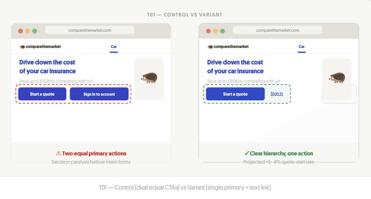
Control and variant rendered side by side with hypothesis annotation and primary metric
Results
Projected uplifts based on industry benchmarks for equivalent CRO interventions. Not measured post-launch results — these are estimates to inform business case and prioritisation.
TEST | CHANGE | ESTIMATED UPLIFT |
|---|---|---|
T01 — Single CTA | Remove choice friction | +5–8% quote starts |
T02 — CTA Copy | Motivation framing | +3–7% CTR |
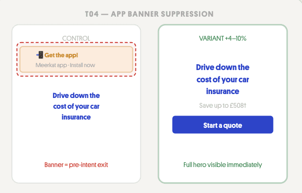
T04 — App Banner | Remove early exit on mobile | +4–10% mobile quote starts |
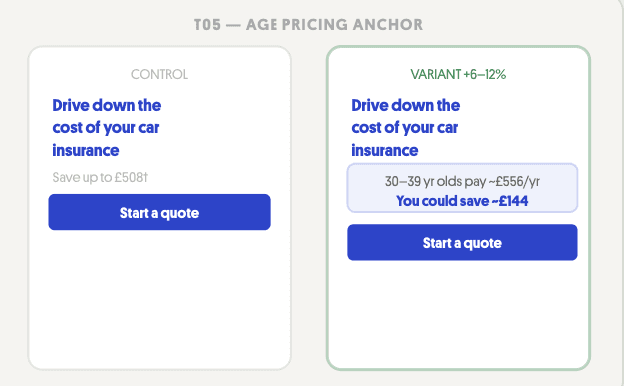
T05 — Age Pricing | Personalised anchor near CTA | +6–12% quote starts |
T06 — Rewards £ | Quantify annual value | +8–15% XS from car page |
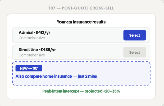
T07 — Post-quote XS | Peak-intent intercept | +20–35% XS from results |
If even three of the six tests beat control, the compound effect on quote volume — at CTM's traffic scale — represents a material revenue opportunity in the tens of millions annually.
What I Learned
CRO work is fundamentally a research discipline. Every element on a high-traffic page is a hypothesis about what users need at that moment — and the ones that have never been tested are usually the ones that feel most obvious.
The most useful question wasn't "what should we change?" It was: what does this UI assume the user already believes? The dual CTA assumes visitors are in two equally distinct modes. The savings claim assumes the headline number motivates equally across age groups. The app banner assumes users have context for the Meerkat app before they've started a quote.
Working from real design tokens also reinforced something I care about: a prototype that looks different from the live product invites the wrong conversation.
My Role
End-to-end funnel audit across desktop, mobile, and tablet
12-test hypothesis backlog with RICE prioritisation
Hi-fidelity prototypes for all six P1 tests — control and variant
Design system extraction from live Figma file and live site CSS
Test specifications with primary/secondary metrics and engineering implementation notes