Description
COMPANY Compare the Market | ROLE Lead Product Designer | IMPACT 5+ taps → 2 taps |
The Problem
When COVID-19 hit, an entertainment and rewards app designed for cinema bookings and restaurant visits suddenly had no core use case. Lockdowns exposed problems that had been masked by high-frequency usage.
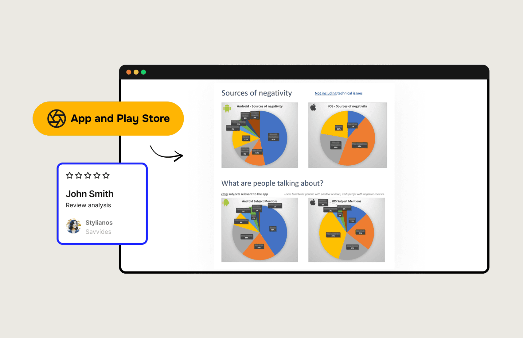
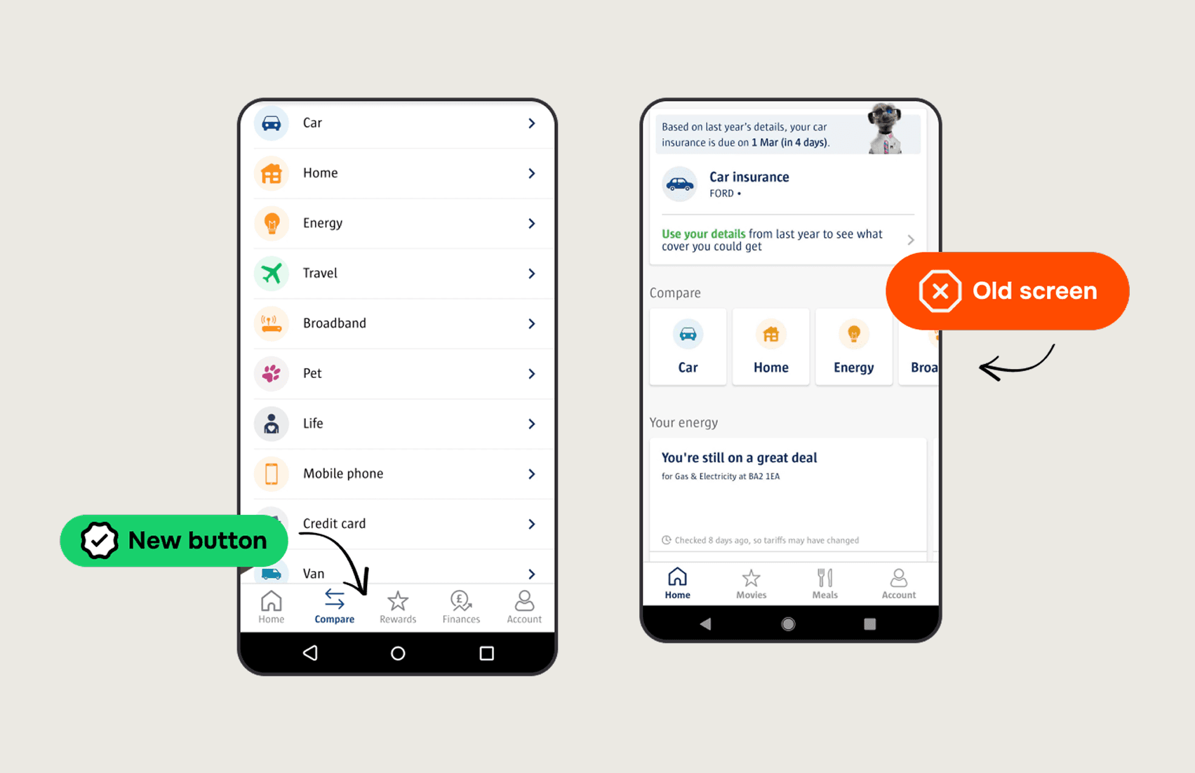
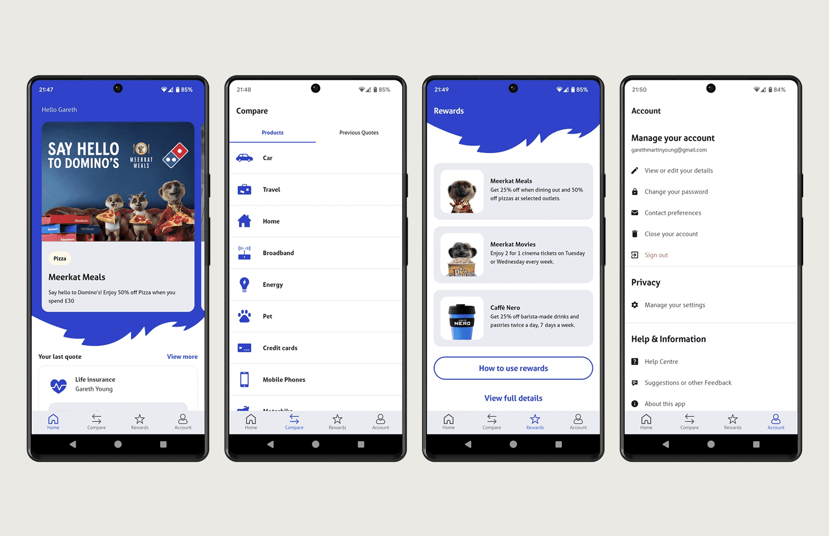
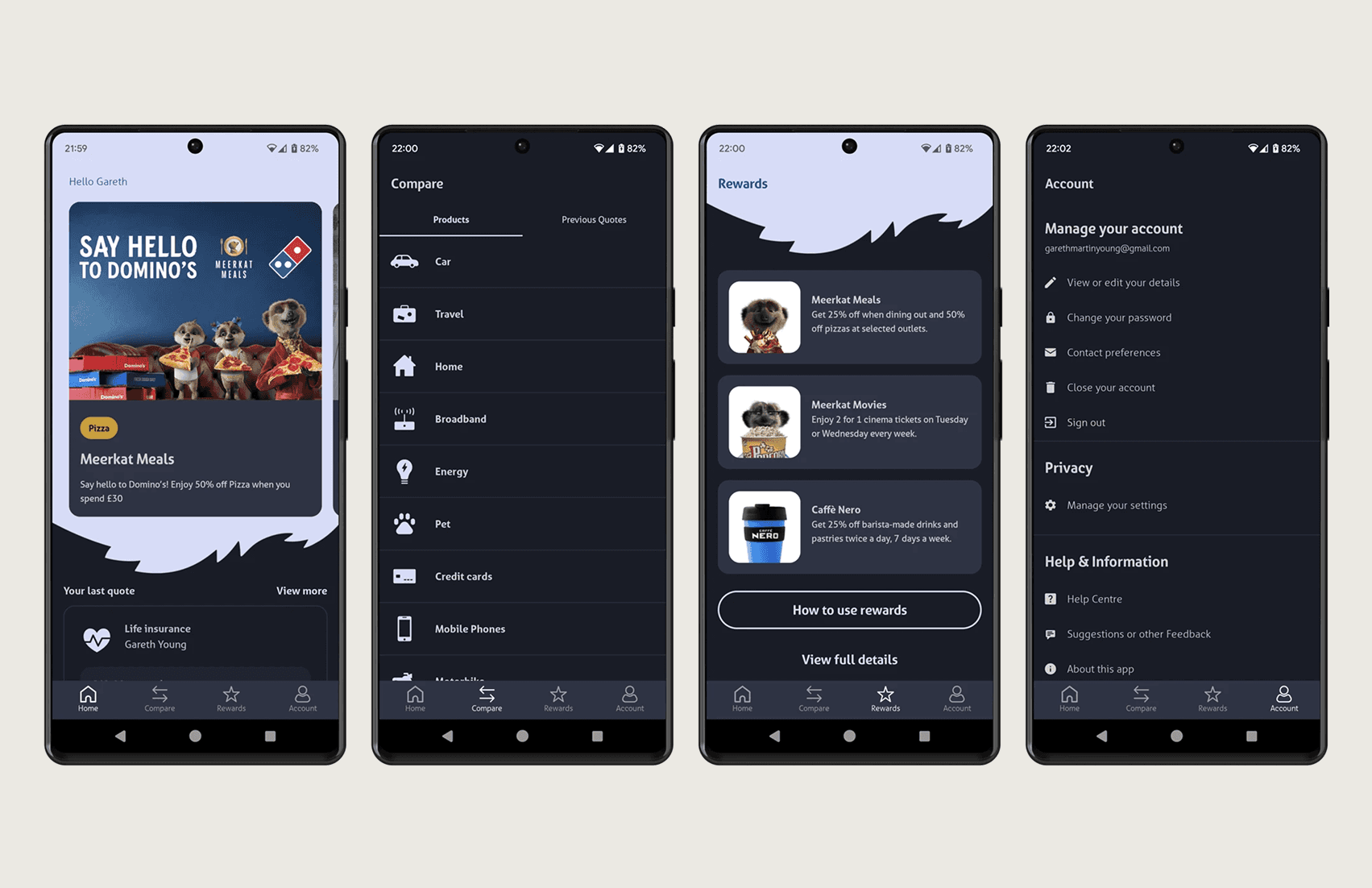
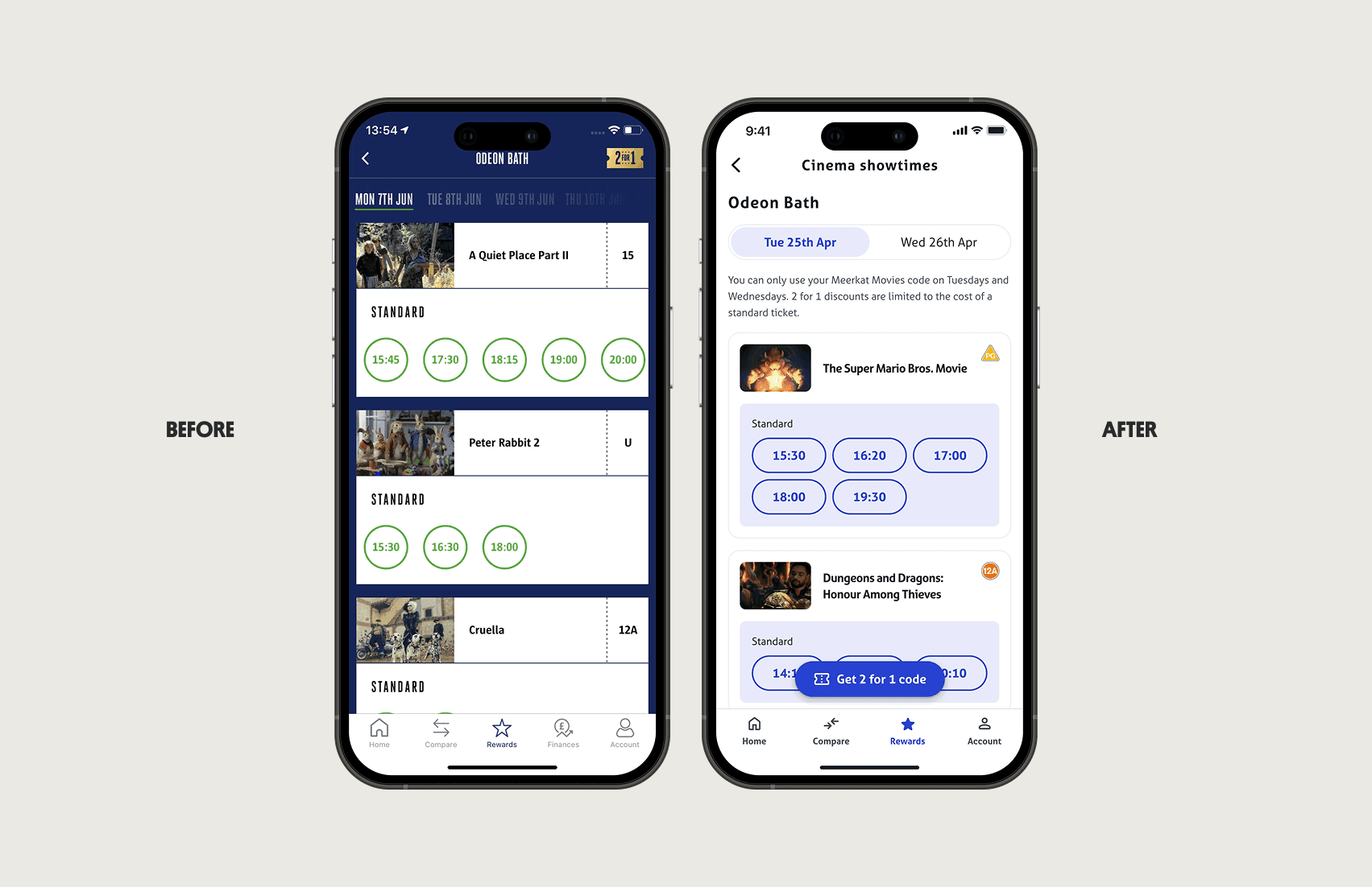
The biggest issue: users couldn't find the app's primary value — discount code generation. App store reviews revealed the #1 complaint was "can't find discount codes." The golden button in the top right corner? Almost invisible to users.
Support tickets spiked. App store ratings dropped. Revenue from mobile declined as frustrated users gave up.
What I Did
I led a comprehensive mobile app redesign focused on making the primary user task — generating discount codes — as frictionless as possible.
My approach:
Analyzed 12 months of app store reviews using data.ai, categorizing feedback themes
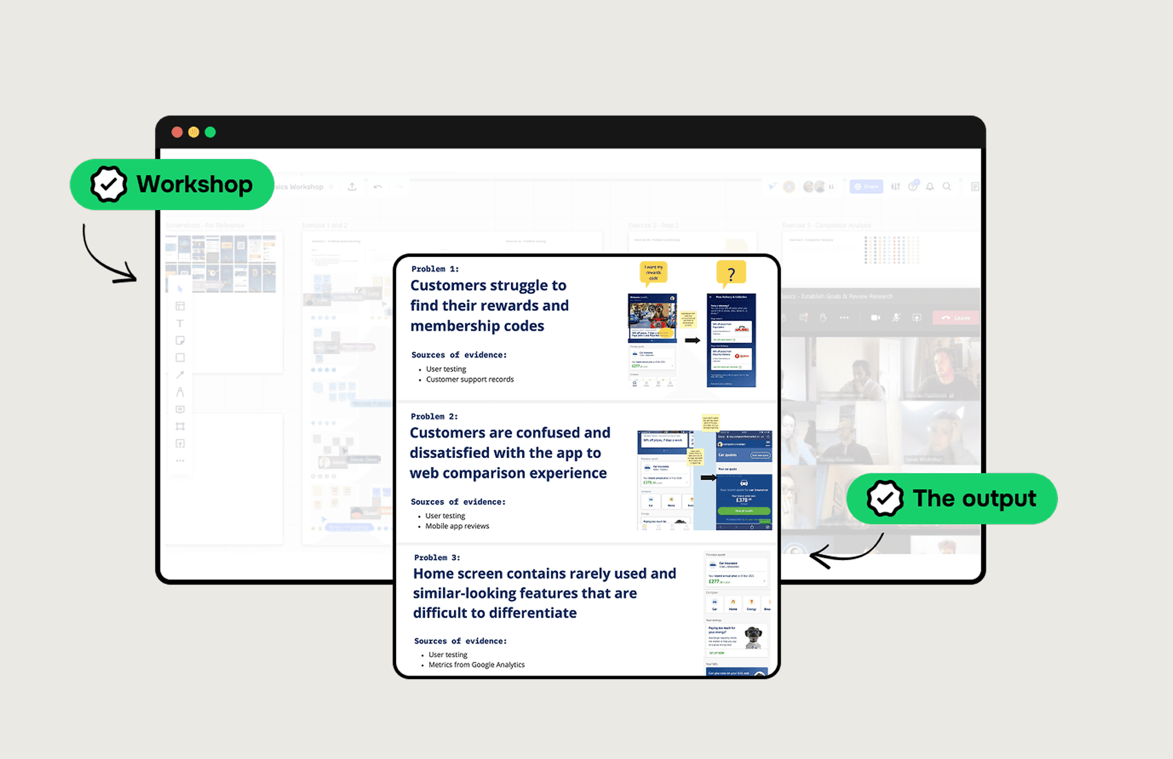
Facilitated a 2-day remote stakeholder workshop with 15 participants to align on priorities
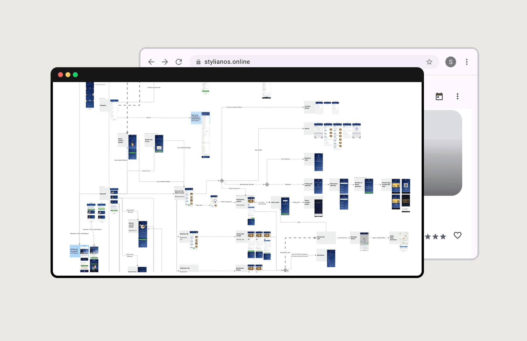
Mapped existing user flows to identify navigation bottlenecks
Created high-fidelity Axure prototypes for realistic user testing
Ran 3 rounds of UserZoom testing (8-12 users per round) to validate solutions
The constraint was significant: work within a risk-averse culture that resisted major changes.
The Insight That Changed Everything
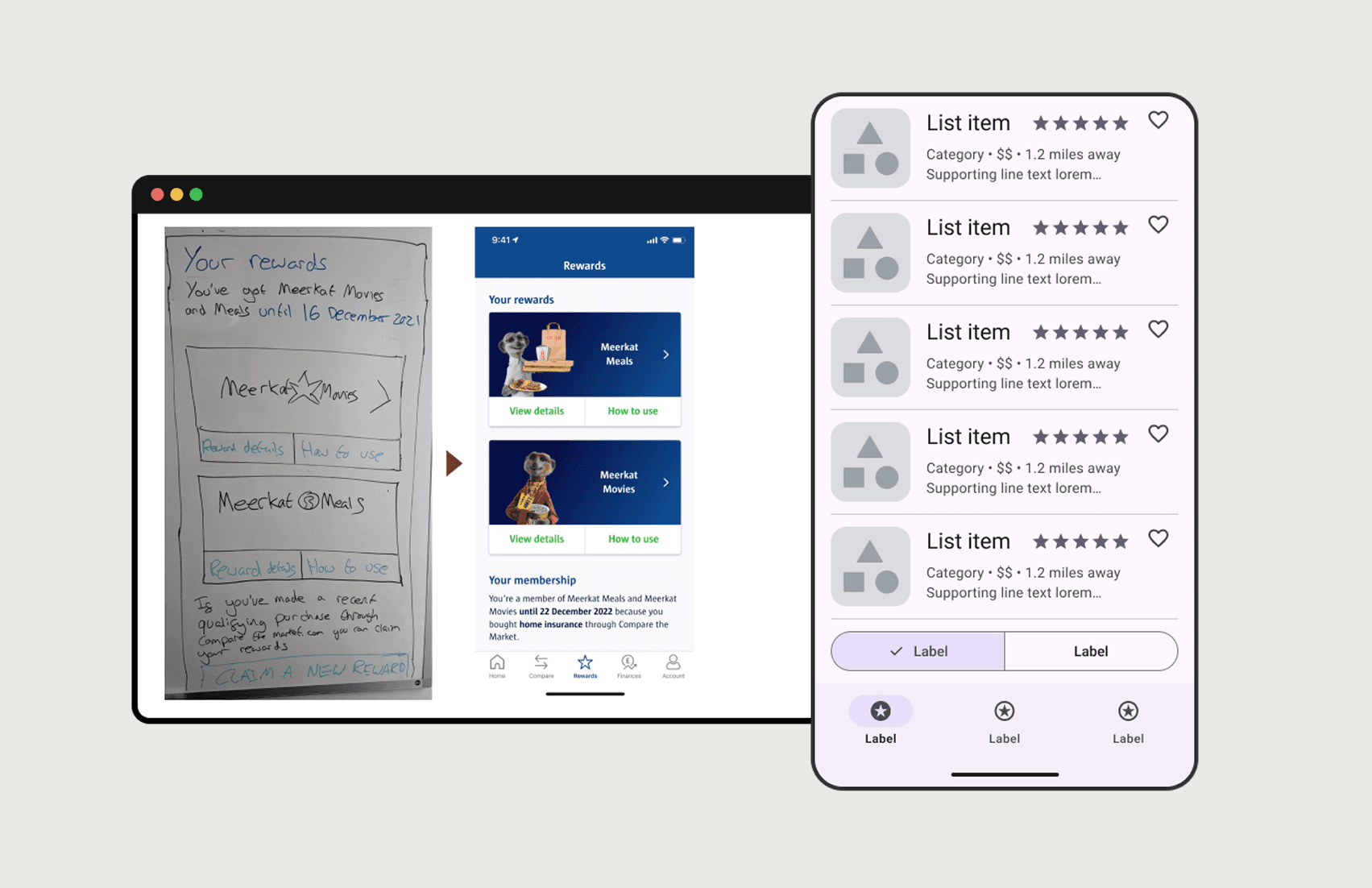
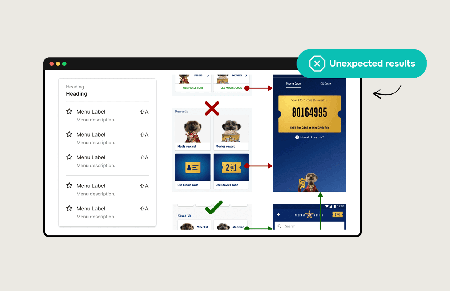
My initial hypothesis: more shortcuts on the homepage would mean faster access to features. I designed multiple quick-action buttons for different reward types.
User testing destroyed this assumption.
When presented with multiple options, users experienced decision paralysis. They consistently chose the first button that "somewhat resembled their goal" rather than finding the right one.
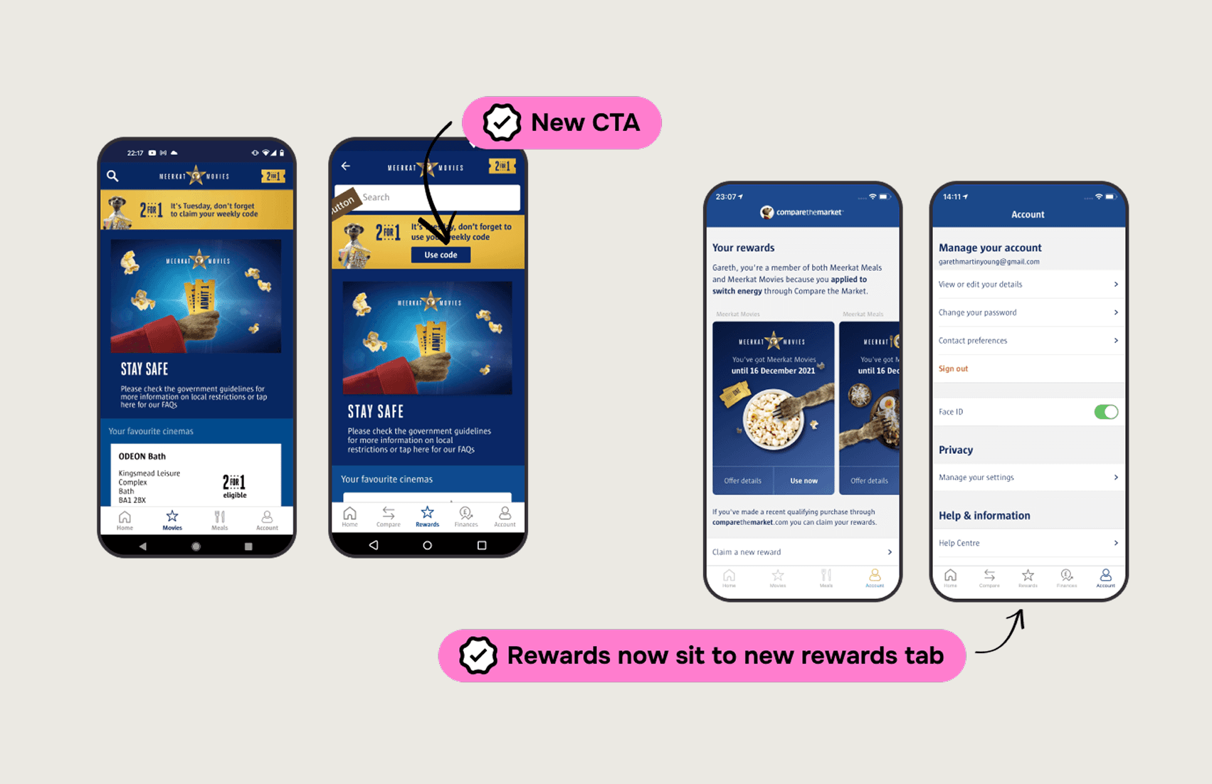
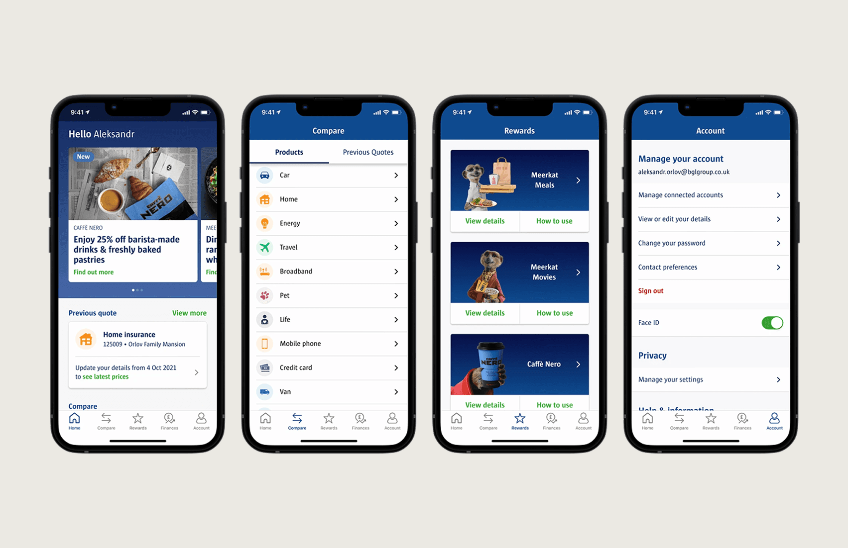
This led to the "One Button Philosophy": a single, clear call-to-action per reward type. Reduce choices, increase confidence.
Key Design Decisions
1. Contextual help beats comprehensive help
Instead of a help section explaining how to find discount codes, I added sticky contextual buttons on relevant screens. On a movie page? "Get 2-for-1 code" button right there.
2. Simplify information architecture ruthlessly
I applied a "Remove, Reorganize, Refine" framework. Eliminated redundant pathways. Grouped related features logically. Reduced steps to complete any task.
3. Design for the constraint, not against it
Rather than fighting the risk-averse culture, I used extensive testing evidence to justify every change. Data made stakeholders comfortable with evolution.
Results
METRIC | BEFORE | AFTER |
Taps to generate discount code | 5+ | 2 max |
Feature discovery rate | Low | High |
App-based sales | Declining | Significant increase |
Support calls (usability) | High | Reduced |
The modular design system created during the project also enabled rapid post-launch additions — like integrating a new coffee chain partnership without redesigning existing patterns.
What I Learned
Test assumptions early and often. My "more options" hypothesis would have shipped and failed without user testing. Simplicity trumps comprehensiveness — users want confidence, not choice. And organizational constraints don't eliminate innovation; they just require evidence-based persuasion.
My Role
✓ User research leadership (app store analysis, stakeholder workshops)
✓ Information architecture redesign
✓ High-fidelity prototyping (Figma - Axure)
✓ User testing design and synthesis (UserZoom)
✓ Design system creation